Foundations · 08
Logo
The symbol is an isometric monogram of the abstracted letters C and F. It is therefore not a signet stuck on top of the brand — it is the smallest piece of the shape language, and everything else on the site is built by the same rules.
Variants



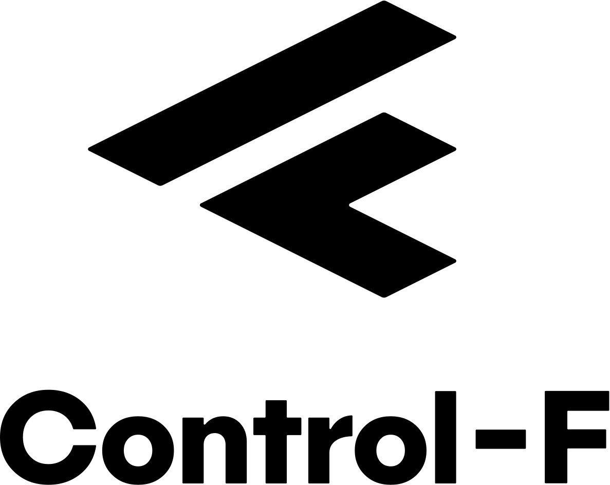
On dark


On the web: the logo plate
On the website the logo sits on a black plate in the top left. The plate is what keeps the mark legible across changing backgrounds — hero artwork, grey wash, photography — without the mark itself having to adapt.
152.09 × 35.25 at rx="2", where a pill would be
rx="17.6". It carried --radius-pill until the vectors were
counted. The manual's frame chapter agrees: it defines five frames — transparent,
square, isometric, app icon, circle — and a capsule is not among them.
→ Geometry
<a class="cf-logo" href="/">
  <img src="/assets/img/logo/cf-logo-horizontal-white.svg" alt="Control-F">
</a>
Frames
The manual defines five frame formats — transparent, square, isometric, app icon,
circle. The web needs two: the square frame at --radius-sm, which is the
nav plate, and the transparent frame, which is the favicon — the signet on nothing,
CF-Schwarz on a light tab strip and CF-Weiss on a dark one, switched by
prefers-color-scheme inside the file. The app icon is for a tile a
platform draws for us and is not what a tab strip gets: at 16 px the plate is most of
what a reader sees, and a filled black square reads as an app rather than as this
mark.
The app icon is the one place in the whole system where the mark is filled with a gradient rather than a flat colour: Farben > Anwendung draws a black tile with the symbol carrying the light ramp. The plate stays black and the mark carries the colour. That plate is the precedent for the black button's foil label. → Buttons
Clear space & minimum size
The construction is based on the unit X — the height of one bar of the symbol. The symbol is 8X wide, the horizontal lockup 10X.
| Measure | Value | Note |
|---|---|---|
| Clear space, critical | 2X | absolute minimum on all sides |
| Clear space, recommended | 4X | the default in layout |
| Minimum size, digital | 20 px height (symbol) | below that the bars merge |
| Minimum size, horizontal | 120 px width | keeps the wordmark legible |
The logo plate has the clear space built in: --space-3 vertical and
--space-6 horizontal at a 20 px logo height is roughly 4X.
The derived arrow
The only decorative glyph in the system. It is the symbol mirrored horizontally, so it
always points in the direction of the action. Used in buttons, accordion rows and
links. It inherits currentColor and is never tinted.
Not allowed
On the logo
- Stretching, rotating, skewing or rearranging the elements.
- Effects: shadow, outline, glow, gradient.
- Tinting — not even in lime.
- Placing it on busy photography without a plate or an opaque surface.
On the arrow
- Not as a bullet or as decoration without a destination.
- Don't rotate it to point left — mirror it instead.
- Don't set it in lime; it takes the text colour.
- Don't mix it with other icon sets.